Guide to website wireframe design


The complete guide to website wireframe design

Wireframes are a powerful way to spot issues before they become expensive problems. But what’s the right approach?

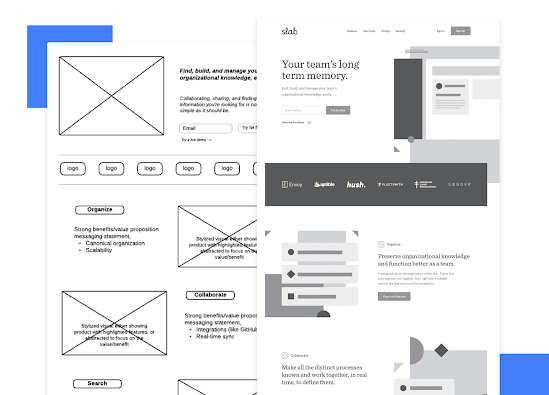
Website wireframes tend to be compared to the classic blueprints for any construction project – a clear picture of how things are going to look, in broad strokes. They are meant to be a practical map, so everyone can see exactly what goes where inside the project. They can be incredibly handy in terms of both product development and communication – aside from being relatively cheap to build.

Just like your good old blueprint, your wireframe has the potential to become your dream-house with the right interactions and components that make an experience great. The wireframe is meant to show your website’s structure, and show the main components of each screen.

Any given wireframe can be split up into 3 different components:

  1. Information architecture: organize every piece of content and visual components to ensure a logical and enjoyable user experience.
  1. Navigation /structure: show global and secondary navigation elements to make sure users can move freely around the product with ease.
  1. Layout design: includes a few visual elements of the interface before the heavy lifting of visual design begins.

A wireframe is basically a map to your website. They are meant to be simple, making wireframes a fast tool to get the design going. But there is another concept at play here, which relates to the degree of detail you apply to your website wireframe: the level of fidelity.


Comments

Popular posts from this blog

Information architecture for UX design

Good UX requires that all information is logical and within reach. Check out this complete guide and leave no user lost behind! What is information architecture? Hierarchical structures Conclusion Whenever we use any website or mobile app, we are faced with an interface that lays down information to us as we need it or look for it. It’s something we are all used to – most users don’t even notice that all the content inside that website has been carefully organized for them. The organization and division of content is known as information architecture (IA), and it is a crucial aspect of UX design. Without proper sorting, most users would be lost and confused when navigating your website or app – rendering the real value of your product moot. After all, what good is an awesome feature if users can never find it? To make sure you have your content well structured and presented to users in the best possible way from the  website wireframe  stage, we here at Justinmind decided to b...

Tips to Design Better Icons

Icons are the elements that add both form and function to your UI designs when used properly. When used correctly, UI icons can speed up user interactions by being immediately recognizable, and they can also add style and visual interest to your user interface designs. Using icons doesn’t need to be complicated. Even a couple of well-placed icons can improve your user experience when done correctly. Check out these iconography tips and best practices before implementing them in your next UI design. 1. Keep icons simple Don’t overcomplicate your  icon designs . Keep them as simple as possible, especially at smaller sizes. The best icons are simple shapes and pictograms that users can instantly identify. 2. Make them recognizable Icons should be immediately recognizable. If users are left wondering what an icon means, it defeats their purpose. Don’t leave users wondering what an icon is supposed to be, as that will only lead to them wondering what the icon’s purpose is, harming the o...