Good UX requires that all information is logical and within reach. Check out this complete guide and leave no user lost behind!
What is information architecture?

Hierarchical structures

Conclusion
Whenever we use any website or mobile app, we are faced with an interface that lays down information to us as we need it or look for it. It’s something we are all used to – most users don’t even notice that all the content inside that website has been carefully organized for them.
The organization and division of content is known as information architecture (IA), and it is a crucial aspect of UX design. Without proper sorting, most users would be lost and confused when navigating your website or app – rendering the real value of your product moot. After all, what good is an awesome feature if users can never find it?
To make sure you have your content well structured and presented to users in the best possible way from the website wireframe stage, we here at Justinmind decided to bring you a guide to IA. Check it out.
Information architecture can be surprisingly difficult to define. This is in part because while other subjects such as content writing can be narrowed to a specific job title – the writer – the field of IA stretches across many professions. In truth, everyone involved in product development applies information architecture methodologies at some point – be it in a wireframe or in a mind map.
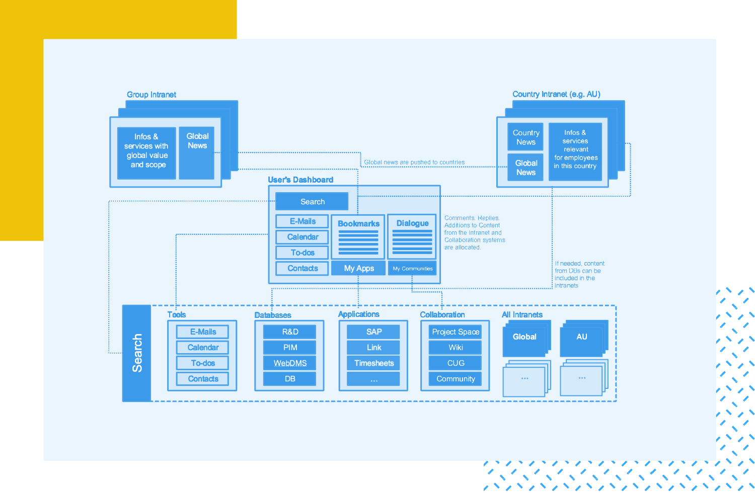
Most websites and apps will need their content divided into parts, so it can both, be understood by users in a quick manner, and be organized so the user can find all the features the product has. Sometimes, this is done so smoothly that users never stop to think about how the information is organized for them.
That is the case for websites such as Google Drive or Medium, which must think carefully about how they present information to the user – or risk getting several features lost in a sea of random buttons and links, that users won’t ever follow or enjoy.
In other cases, you can see that the use of architecture in information is extreme and clearly noticeable – as well as very difficult to pull off. It’s the kind of thing that requires ingenious design, a good wireframe tool and constant testing.
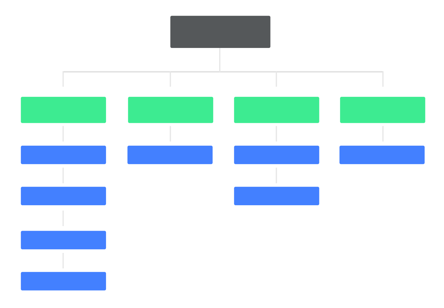
Also known as tree structures, this would mean using a trickle down-effect, in which you use broad categories at the top, and more specific and smaller subcategories the user can navigate through.
This visual hierarchy works well to convey the importance of different pieces of information, as it displays them in a ladder of relevance.
Information architecture is vital if you want users to understand your product enough to enjoy it. You want to create a structure that your users can not just understand but also predict – so people don’t need to go in circles looking for information and can learn their way around your product easily.
Remember that good information architecture and good UX design go hand in hand – be it in delivering a blog post to a reader, or helping a new player get settled in your open-world video game.
Rule of thumb: Pay attention to detail, and don’t bombard your users with more information or more decisions than they can handle.
Using your product should feel natural and not like running a marathon, or looking around the house for a that phone charger you haven’t seen in two days. Take every opportunity to test your information architecture in your user testing – make sure people don’t get confused or frustrated with the way information is presented to them.
When you have a lot of information, it can very tough to present all this information in a way that makes sense. But humans have always found ways to make sense of information, and you should be able to reflect that in your design with the right planning – so don’t panic!
Just breathe and go back to the root of everything: what is the user’s goal at any point in time? How can you help the user reach that goal in the easiest way possible?
Comments
Post a Comment